
Storefront
The Description tab in the PWA editor is a builder for that "in-store" page users see before installing: the icon and screenshots, the copy, and the rating with reviews. Put together a convincing storefront here, and you'll get more trust and higher install conversion.
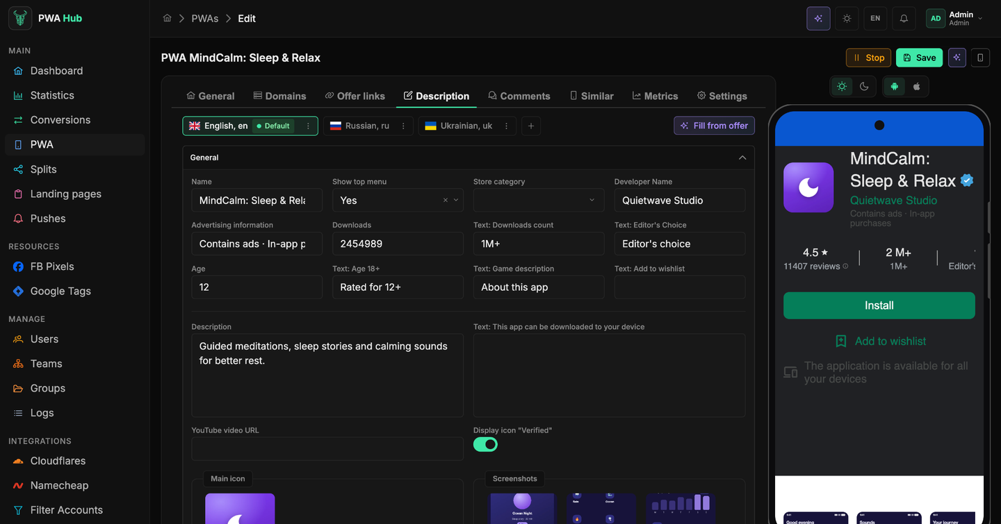
Everything is organized into collapsible sections - you can open only what you're editing right now and collapse the rest so the long form doesn't distract you. Below is not a list of every field, but a breakdown by purpose: what each block is responsible for and how to quickly set up what you need.
Changes take effect only after Save - the general rule for the form is described in the "PWA - creating" section.
The storefront preview
The phone button in the top right corner of the card opens a live preview - a phone mock-up with your storefront appears next to the form. It is available on every tab of the app, so you can check the result without leaving "Domains" or "Metrics". Two switches sit above the mock-up: light / dark theme and Android / iOS - the storefront redraws for the chosen variant right away. The preview scrolls like a real store page: below the icon come the screenshots, the description, the reviews and the block of similar apps.
A storefront in several languages
Above the form sits a row of the app's languages. One of them is marked Default, the rest you add yourself with the + button. Switch a chip and you're editing the storefront in that language.
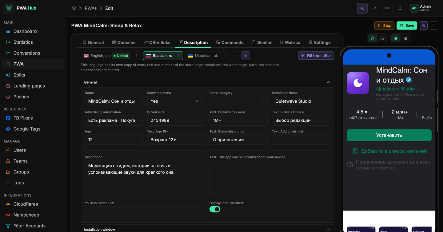
Each language has its own copy of every text and number of the storefront, while the templates, the white page, pushes, the icon and the screenshots are shared across the app. Put simply: translate the description into Russian and the English version stays as it was; replace the icon and it changes everywhere.
- + adds a language. In the dialog you can tick Translate from {default} with AI right away - the texts arrive already translated.
- The sparkles button next to the chips translates the current language from the default one with AI; it only shows while a non-default language is selected. The model and the prompt for translation are set by an administrator in "Settings", the AI Generation card.
- The ⋮ menu on a language chip lets you make it the default, change the language or delete it. Deleting asks for confirmation: the language takes its texts and its reviews with it.
Which language a visitor sees
The storefront is shown in the app's language, not the visitor's browser language. If there's no translation for a language, the built-in labels stay in English. So set up a language for every GEO you send traffic to - or at least check that the default language matches your audience.
Storefront template
The storefront's look - its color and overall style - is set by the iOS template and Android template fields on the General tab: the app detects the visitor's platform itself and shows its variant. The mobile preview on the right shows the result right away, and the buttons above the phone switch the platform and the theme (the preview itself is covered in the "PWA - creating" section). There are three variants:
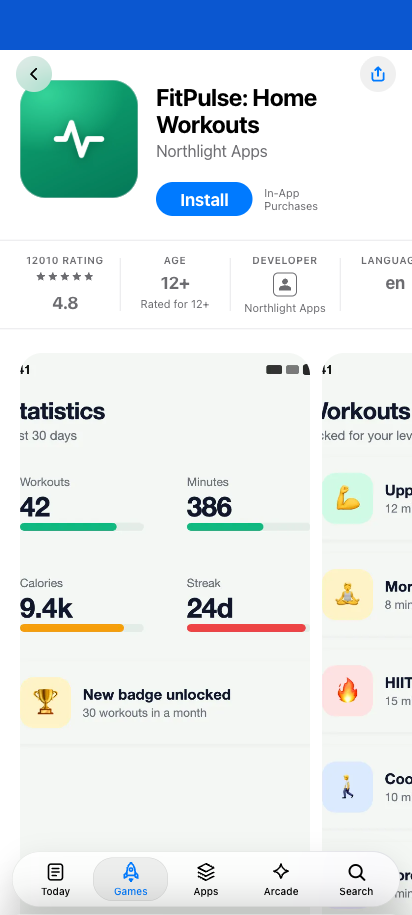
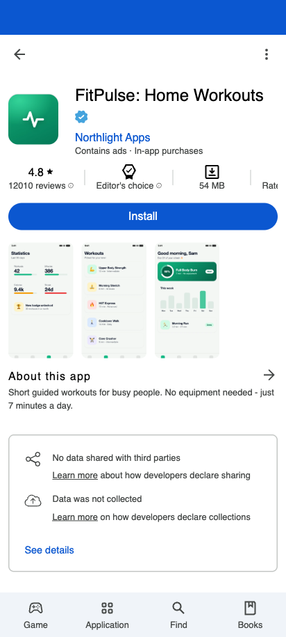
- Native Store (iOS) - an App Store-style storefront: the app card, the Install button, screenshots and ratings as in Apple's store.
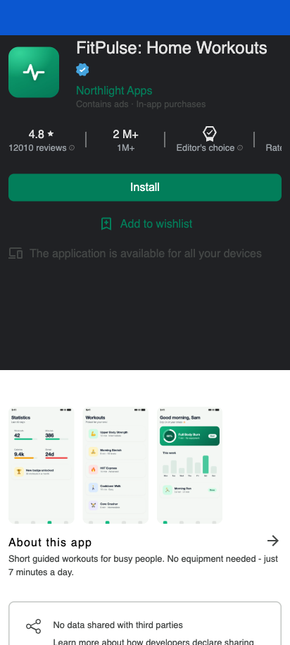
- Native Store Green (Android) - the classic Google Play page in the green look; if a video link is set, a trailer is shown at the top. No bottom menu.
- Web Store (Android) - the blue look with the signature Google Play menu pinned at the bottom (Games, Apps, Search, Books). The menu labels follow the storefront's language.
Value and label - why there are so many fields
Before diving into the sections, understand the main principle - and half of that "scary" list of fields will immediately make sense. Many settings come in pairs:
- the value itself - a link, a number, a date (for example, the download count);
- a separate label with the Text: … prefix - the caption the user will see next to that value.
Thanks to this, you have full control over what's written on the storefront without touching the data itself: you can set any number of downloads and label it however you like, translate the labels for your language or geo. If you see a field like Text: …, that's just text on the page, not logic.
Icon, screenshots, and theme
The visual part is set in the General section.
- Main icon - a single image, the app's icon.
- Screenshots - a set of images for the carousel on the app page.
- Store category - a Games or Apps label. The page's color and overall look are set not by it but by the iOS template / Android template fields on the General tab (see "Storefront template" above).
To update an image: select a file in the upload block - it will appear in the preview; to remove one, delete it there. Both are applied on Save.
Images are sent to the server only on save
Selected files are held in the preview and are not uploaded immediately. Deletion is also deferred: the image is first hidden locally and physically removed only when the form is saved. Assemble the icon and screenshots, check the preview, and click Save once.
Storefront copy
The main page copy also lives in the General section:
- Name and Developer Name - how the app and its author are labeled in the header.
- Description - the main text the user reads.
- YouTube video URL - if you want to show a clip. Only a valid embed link is accepted; the field highlights an invalid one with an error.
- The Show top menu toggle (Yes / No).
- Display icon "Verified" - a verification mark next to the name.
Nearby you configure the "store" counters and their labels - Downloads, Age, Advertising information - as well as texts like "Editor's Choice", the "18+" label, "Add to wishlist". Following the principle from the section above: the value is on the left, and Text: … next to it is what the user will see.
These texts belong to each language
Everything listed in this section belongs to the language selected at the top: names, descriptions, captions and even download counts can differ per language. Switch the language chip and you're looking at another copy of the same fields.
Fill from an offer
The Fill from offer button on the Description tab writes the storefront copy for you: from a short offer description AI suggests the name, developer, description, what's new, rating and reviews.
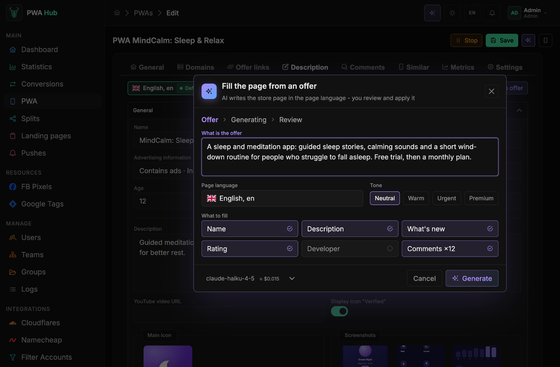
- Click Fill from offer.
- Describe the offer in What is the offer: what the product is, who it is for and what makes it appealing. The more specific, the livelier the copy.
- Check the Page language and pick the tone.
- Tick what to fill: Name, Description, What's new, Rating, Developer, Comments.
- Click Generate.
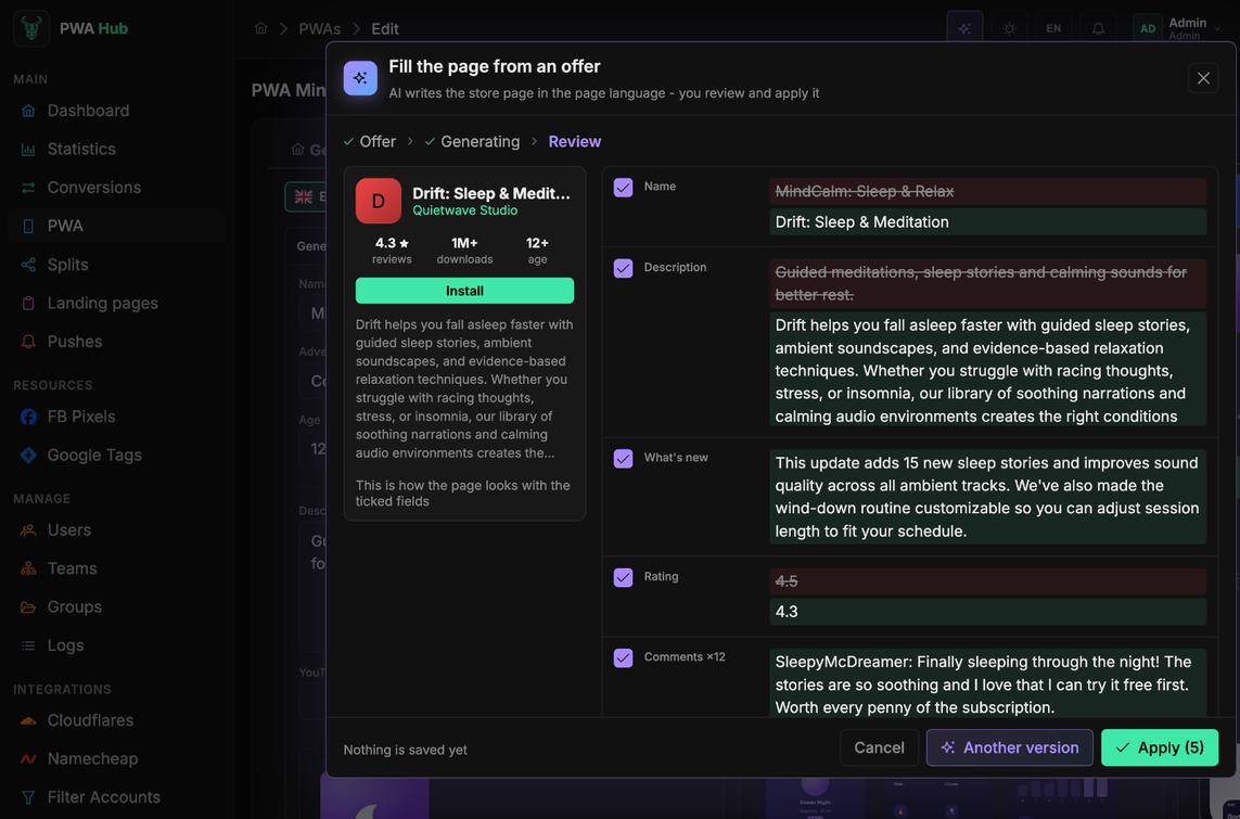
On the Review step the left side shows how the storefront will look, the right side shows the old and the new value of every field. Untick a field you want to keep, or click Another version for a new variant. Apply moves the ticked fields into the form; they are stored only after Save.
Install button
The Button section sets the install-button labels a visitor sees: from "Install" to "Open" after installation. It also has the File size, Mb field - it's shown as "N MB" in the info panel next to the age and download count.
Rating and reviews
The Rating / Feedbacks section builds the rating block on the app page: the average score, the total number of reviews, and the distribution by stars (Rating 5 … Rating 1).
Configure just one thing
Rating (an average score from 0 to 5 in steps of 0.1) and the star-distribution sliders are linked: change the overall score and the percentages recalculate themselves; move the sliders and the average recalculates. Set whatever is convenient for you, and the other will adjust automatically.
The rest of the section holds the block's own labels: the "Ratings and Reviews" heading, the review verification mark, the "Was this information helpful?" question with Yes / No buttons, the "All reviews" link, and the counter of people who marked a review as helpful.